
This user has no status.
This user has no status.
Member


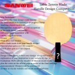
As I dig research deeper into table tennis blades, I noticed different brands tend to have a certain style, for better or for worse.
You may have a different opinion on aesthetic but just so you know.
You are wrong.
Just kidding.
(Surprise! It is a generalisation, which is not necessarily bad.)
Butterfly:
Butterfly is basically the Gucci of TT blades. They are more than pleasing to look at a sense that they seem to employ some creativity without being pretentious, while maintaining a premium feel. Of course, it is only mostly true for high end product but it is still hard to find an ugly one for the affordable ones.
Donic:
It kind of feels like the cool kid in the room. Their blades certainly don't excel in being artistic but there seems to be effort made to an extend. They usually won't go off road with their patterns, though they like to mix numerous colors in one blade to give an overwhelming chaotic feel (the sensoes and crests series).
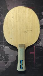
Nittaku:
Some of them just look like a lump of wood, which I would call them the wood type. It is not ugly but boring. Even though some people like it but that won’t do it for me. Other than that, they got some elegant design that is simple (like proper simple with a coherent recognisable style), for instance the violin and acoustic. Despite the fact that there are still a few run of the mill designs i.e. the lazy ones/the mass orientated ones. More specifically, a single-coloured handle with a rectangle ring surrounding the side. e.g. Forestia and ludeack.
Andro:
I haven't investigated how practical they are to use on the table but just the look of it is enough to stop me. Most of them are typical designs that doesn’t have originality and boring. Whenever they took creative freedom, it just collapses to…well, being ugly.
Xiom:
Some wood type & some lazy type. Then it is a over the top and cringy designs, for example the Vega, Omega and Hayabsa. I would never buy and use them no matter how good they are to use. BTW. The Ice-creams are fine but it is a bit too lazy and simple for me for a top of the line product.
Stiga:
Do they need a designer or something? XDD Most of them is just a lump of wood (a whole brand of the wood type). The ultimate embodiment of no design. At most, I can call it a clean design. (Azalea looks good)
Joola:
They have some lazy types. Besides that, a significant portion of their design pattern are just random and all over the place. The colour is bizarrely full of contrast, which is a bit uncomfortable to look at. However, The PBO-C looks really nice whilst the aruna and solja are fine.
Tibhar:
Fairly typical so tot much to say. Quite a bit of lazy types. Their design feels a lot like Joola but the designs are more conservative and safe. But again, still some good designs for the premium section e.g. the kinetic speed and Cedrick Nuytinck.
You may have a different opinion on aesthetic but just so you know.
You are wrong.
Just kidding.
(Surprise! It is a generalisation, which is not necessarily bad.)
Butterfly:
Butterfly is basically the Gucci of TT blades. They are more than pleasing to look at a sense that they seem to employ some creativity without being pretentious, while maintaining a premium feel. Of course, it is only mostly true for high end product but it is still hard to find an ugly one for the affordable ones.
Donic:
It kind of feels like the cool kid in the room. Their blades certainly don't excel in being artistic but there seems to be effort made to an extend. They usually won't go off road with their patterns, though they like to mix numerous colors in one blade to give an overwhelming chaotic feel (the sensoes and crests series).
Nittaku:
Some of them just look like a lump of wood, which I would call them the wood type. It is not ugly but boring. Even though some people like it but that won’t do it for me. Other than that, they got some elegant design that is simple (like proper simple with a coherent recognisable style), for instance the violin and acoustic. Despite the fact that there are still a few run of the mill designs i.e. the lazy ones/the mass orientated ones. More specifically, a single-coloured handle with a rectangle ring surrounding the side. e.g. Forestia and ludeack.
Andro:
I haven't investigated how practical they are to use on the table but just the look of it is enough to stop me. Most of them are typical designs that doesn’t have originality and boring. Whenever they took creative freedom, it just collapses to…well, being ugly.
Xiom:
Some wood type & some lazy type. Then it is a over the top and cringy designs, for example the Vega, Omega and Hayabsa. I would never buy and use them no matter how good they are to use. BTW. The Ice-creams are fine but it is a bit too lazy and simple for me for a top of the line product.
Stiga:
Do they need a designer or something? XDD Most of them is just a lump of wood (a whole brand of the wood type). The ultimate embodiment of no design. At most, I can call it a clean design. (Azalea looks good)
Joola:
They have some lazy types. Besides that, a significant portion of their design pattern are just random and all over the place. The colour is bizarrely full of contrast, which is a bit uncomfortable to look at. However, The PBO-C looks really nice whilst the aruna and solja are fine.
Tibhar:
Fairly typical so tot much to say. Quite a bit of lazy types. Their design feels a lot like Joola but the designs are more conservative and safe. But again, still some good designs for the premium section e.g. the kinetic speed and Cedrick Nuytinck.